Each week my instructor amazes me! His passion for floral design shines through and this latest lesson was no exception.
This past week we discussed the secondary design principles. These principles are an important consideration when creating your design. Each principle is related to one of the primary principles of design. The secondary principles are:
1) Scale: The size relationship of the composition to its placement. If you’re decorating a large area, you’ll want to create a large design to complement it. If it’s a small space, you’d want to create a small design that doesn’t overpower that space. Everything in the design should fit together.
2) Transition: This is the way that we relate one material to another within a design. We can graduate in size, shape, or color, (sequencing). Material is placed from smallest to largest, lightest to darkest.
3) Tension: Tension provides contrast. We can provide contrast through the use of color and through the shape of the flowers in our arrangement. It elevates a design to the unexpected, and provides an imminent release of energy. It’s slightly contrary to what we’re expecting.
4) Repetition: The repeating of like elements within a composition. This includes: line, form, color, space, texture, pattern, or size.
5) Opposition: Most often seen in the design lines. We create contrast by creating tension because lines, colors or textures within our design are the opposite of what we expect. Opposites attract because their differences provide us with the highest form of interest. Opposition allows us to add excitement and a breath of fresh air to a design by mixing in contrast.
6) Depth and Emphasis: We can create depth in a design by placing elements at various heights in our composition. This will add interest and give the appearance of fullness, as well as more dimension. By adding interest, depth provides emphasis. It brings the inside of a creation into visual focus. Depth adds visual volume to the design. Textural materials are often used to add this dimensional element.
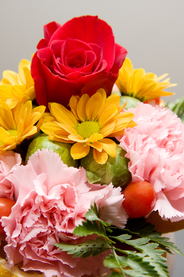
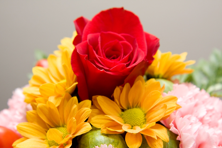
7) Dominance, Focal Area: This is an area within a design where added emphasis or visual weight commands attention. In a focal area, more than one element, or multiples of a single element can be used. It’s the dominant feature within your arrangement. An example would be a single red rose, like the one pictured below.
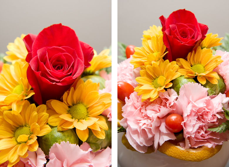
My latest creation is a Biedermeier arrangement which is a very compact arrangement using flower bulbs with very uniform sizes arranged in tight concentric circles from the center outward. From the top it’s viewed like a target and from the side it looks like a top. Accents are hardly used, sometimes using two or more colors as an option.
In addition to the rows of pink carnations and yellow-orange daisies, I’ve used fruit and vegetables within this centerpiece including: 5 orange slices along the outer rim, 6 brussel sprouts and 5 grape tomatoes. It’s very organic and quite striking! Don’t you think?
Until next time, here’s a kiss and a smile! 🙂